Collapsible App Bar With MotionLayout in Jetpack Compose

We have seen how we could create collapsing app bars/toolbars with the view system before, using the AppBarLayout & CollapsingToolbarLayout. Now in Jetpack Compose, nearly everything is entirely customizable. Expanding and collapsing a toolbar can be achieved without the help of MotionLayout as making animations in Android has never been easier with Compose animation APIs. But, we want to animate multiple properties/attributes of a view or a composable depending on the keyframes of an animation, or we might want to have a complex animation. Therefore, MotionLayout comes to the rescue as it simplifies the process by defining ConstraintSets that tell how the layout/UI would look at the start of the animation and how it would like at the end of it, and simply MotionLayout will animate through those sets.
Let’s start by adding our dependencies, or actually our single dependency
In the view system, motion layout is a subclass of constraint layout, which makes sense why we are using constraint layout dependency here.
Now let’s move to define our constraints sets. unlike defining them with XML in the view system, motion layout in compos uses JSON5 syntax which is pretty similar to JSON. Create a new json5 file by placing it into your raw files under res. if you don’t have a raw file create one by right click on app>New>Android Resource Directory and under resource type choose raw. Finally, create a file named motion_scene.json5 file.
Just like JSON, we start an object and then we define another ConstraintSets object where we place our sets of the layout. Notice here how we didn’t add quotations between the keys names as JSON5 doesn’t require us to do so.
Within each set (start & end) we add our children views as objects then we start giving them attributes and constraints just like constraint layout and motion layout.
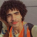
Here we defined how each and every view would look like at the start phase of our animation. each object’s name represents the ID of that view (e.g. user_name. box_image, etc.) which we gonna later use in our compose project. Width and height attributes are self-explanatory and their values are considered as Dp. Passing ‘spread’ as a value to width or height keys is equivalent to 0dp or match constraints in the view system. Now to give constraints to our objects or views, we would use top, bottom, start, and end attributes. As you can see the weapon_icon is constrained from the start of it to the start of the parent, the end of it to the end of the parent, and finally the bottom of it to the top of the user_image with an 8dp margin.
So defining constraints is like defining a list. First, you give the name of the list which points to the direction of where you want to constrain the current view (top, start, bottom, or end), then the target view to constrain the object to, and finally the direction of the target view to be constrained to. And the last argument is optional and it is where you would add some margin to the current view from the target view.
We have also defined an alpha for box_image which is a known attribute in the view system. But what is custom? We have a custom key as an object placed within the box object and this is how we would define a custom attribute to our view in motion layout in compose. It is equivalent to the CustomAttribute tag in old view world.
After Completing the start phase of our animation, it’s time to declare the final look of it. Now within the end set let’s place our same views but with different values for their attributes.
Pretty much the same process, the same IDs, and the same attributes. You could notice that we changed some values, for example, the alpha of the box_image was 1 in the start set and now it’s 0 in the end set. Similarly, the roundValue is now 0 for the box after making it 25 as well as the width and height for other views.
Now motion layout will do its best to transition from start to end sets. Before adding any custom transition, let’s see our result.
So within MotionAppBar composable, we access our motion scene file from raw resources then we define our progress variable, which we gonna use to transition from start to end depending on a float value coerced in-between 0 and 1. We want the animation to start if our first visible item of a list in lazyColumn is not the first, second, third, or fourth item. We also defined motionHeight for the MotionLayout composable to change accordingly during the animation to act as a top app bar. After fetching the motion scene we pass it to the MotionLayout composable along with the progress, and finally within the scope of motion layout we place our children composables and give them their IDs which we have already defined in the motion scene file by using the layoutId modifier and they will be placed according to our constraints. Now to make use of our custom attributes, we access them by motionProperties composable function and pass the ID of the view that we want to retrieve this custom property from. Lastly, we access this custom property by calling .value to get the value and .datatype to determine the type of the value of this custom property which is int in this case. So we call .int and pass the name of the attribute (roundValue).
Let’s test this behavior in our MainActivity.kt file, we create a Scaffold composable to pass our MotionAppBar composable to the topBar argument. Notice the same lazy state is passed to the LazyColumn composable as well as our custom app bar to track the visibility of the first items. It’s also important to add animateContentSize() modifier to animate the the height of the lazy column once the height of the top app bar changes.
Pretty awesome right? Now let’s add our custom transition to make the app bar end state more elegant. Within the parent object, just underneath the ConstraintSets key in our motion_scene.json5 file we define our Transitions JSON object.
Here under Transition, we define our default behavior for the animation. First, within the default object we construct our animation by adding where it should start from and to, and the arc path that our animation should take. The attribute pathMotionArc is set to transition through a vertical arc when the animation starts. Additionally, we describe how our views should animate their properties throughout the defined frames. For instance, under KeyFrames object we have a list of KeyAttributes objects and there is where we designate the properties values for each keyframe.
Let’s discuss the first one to make things clear. Firstly, the first object is targeting user_image view and there we set two frame 0 (beginning of the animation) and 100 (the end of the animation) and then follows the rotationZ attribute where we passed 0 and 360 degrees. That’s it, you have to do no more work, motion layout will take care of animating the rotation in the z-axis from 0 to 360. For the remaining objects, things are the same, just make sure that you pass an counterpart value for your attributes to every frame that you set.
Here’s our final result and here’s the full source code. I hope you enjoyed it and if you did, don’t forget to give a 👏.
